Create a visual identity for Milko — a lifestyle brand blending organic milkshakes and music. The design must balance health, flavor, and rhythm with a modern, minimal aesthetic.
Project Goal
Create a visual identity for Milko — a lifestyle brand blending organic milkshakes and music. The design must balance health, flavor, and rhythm with a modern, minimal aesthetic.
Design Challenge
How can we turn a milkshake into a mood?
How do we express sound, movement, and wellness through clean visual language?
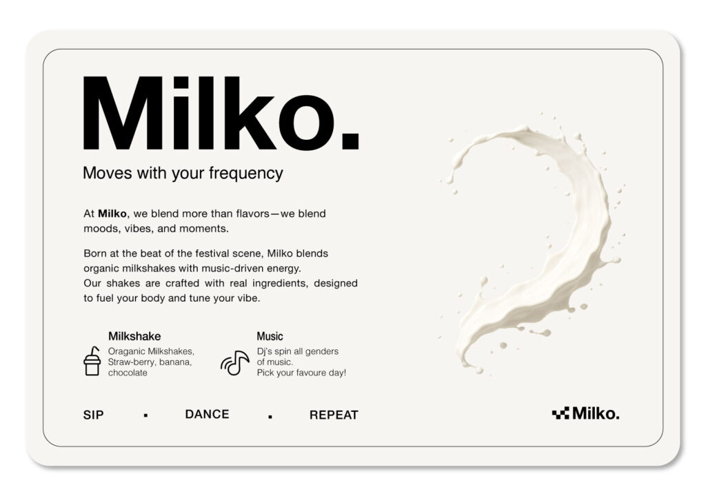
Logo.
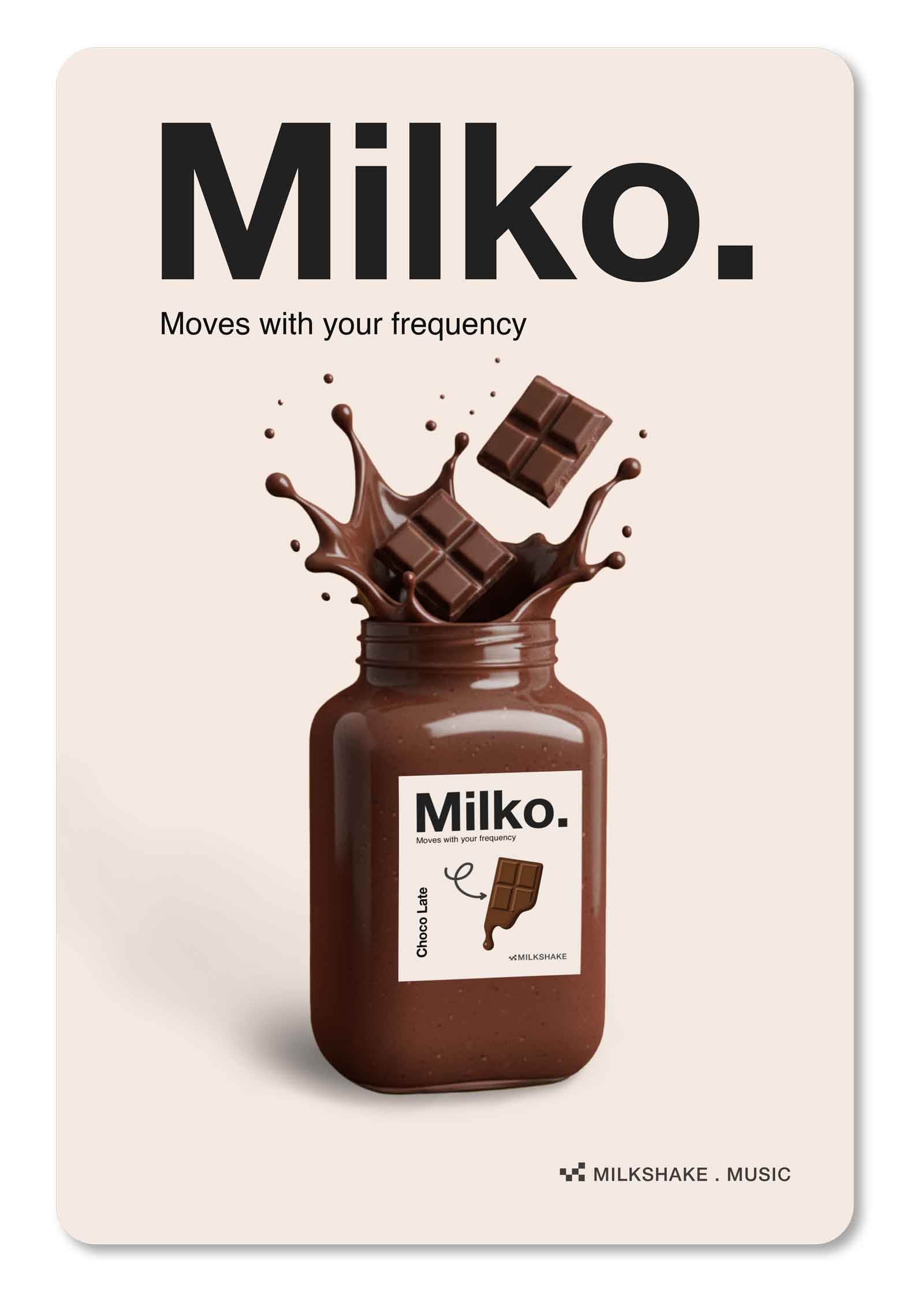
Milko.
Moves with your frequency.
The Milko logo blends simplicity and motion. Its five squares represent the rotational energy of a blender—cleanly abstracted into a modern symbol.
This visual rhythm captures Milko’s essence: a brand that mixes flavor and music in perfect harmony.
Designed for motion, the logo adapts seamlessly to animation—spinning, pulsing, or syncing with sound.
Web Header
Print/Packaging
App icon
Social profile
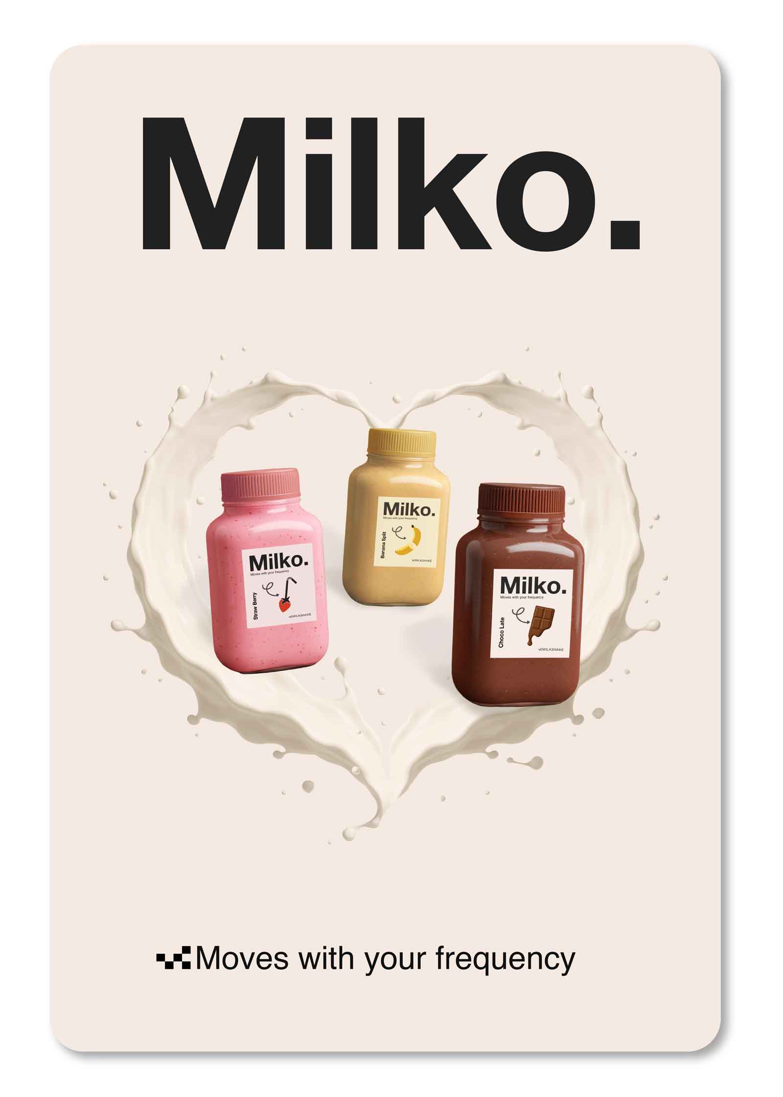
Milko is more than just a milkshake — it’s a vibe.
Born at the beat of the festival scene, we blend organic ingredients with music-driven energy to keep you moving.
Crafted for high-volume moments — front row or backstage — every shake fuels your body and tunes your mood.
Real fruit. Clean energy. One rhythm.
Sip. Dance. Repeat.
Moves with your frequency.
Elements.
Motion as Metaphor
Curved arrows and splashes visualize rhythm and energy.
Concept.
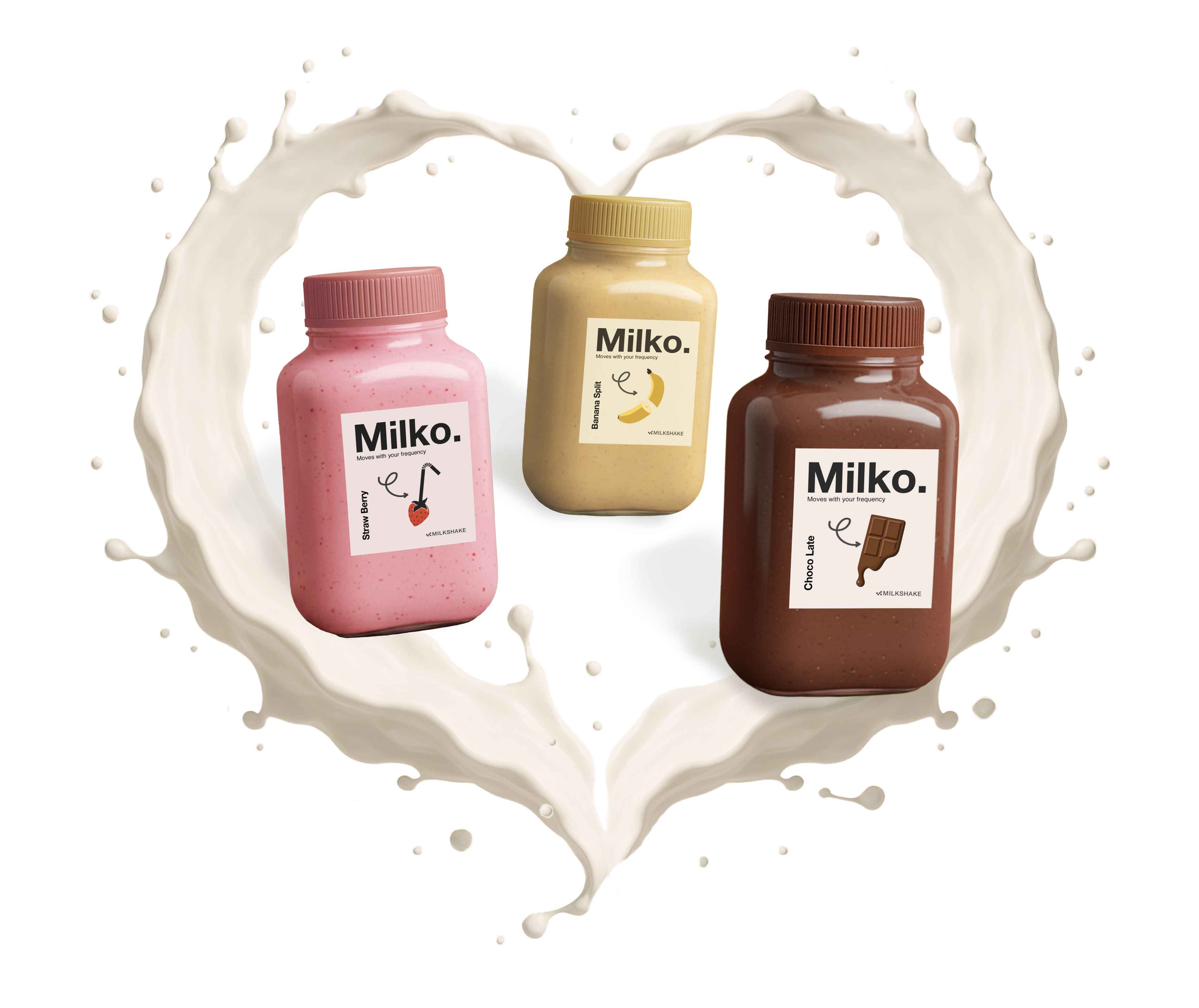
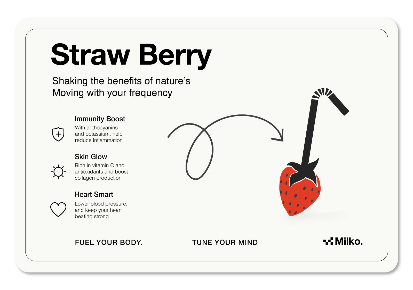
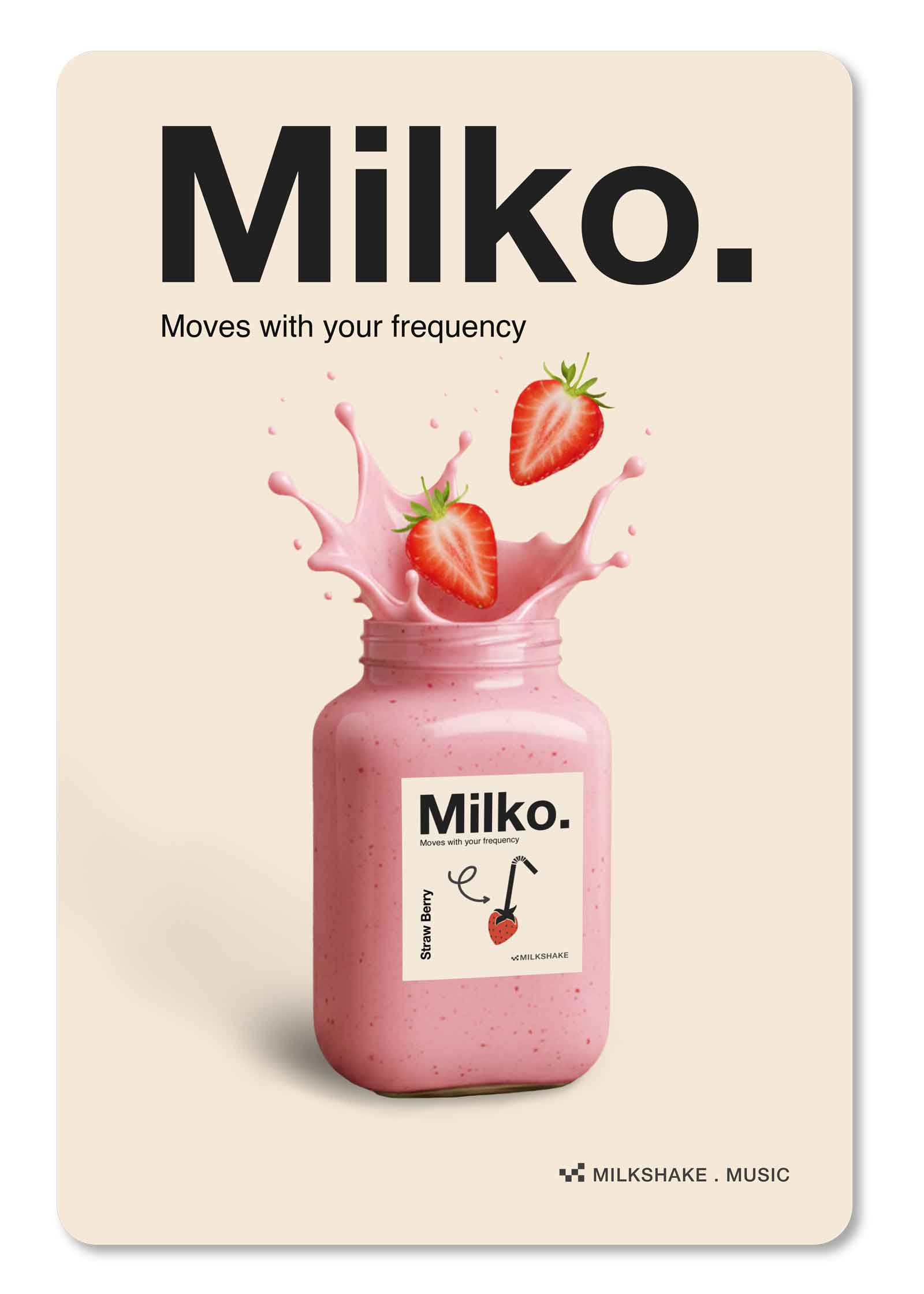
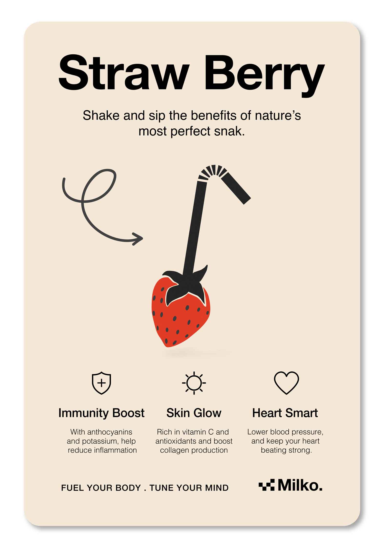
A berry becomes a straw. Playful, direct, a literal twist that reads instantly.
The arrow signals motion, blending in action.
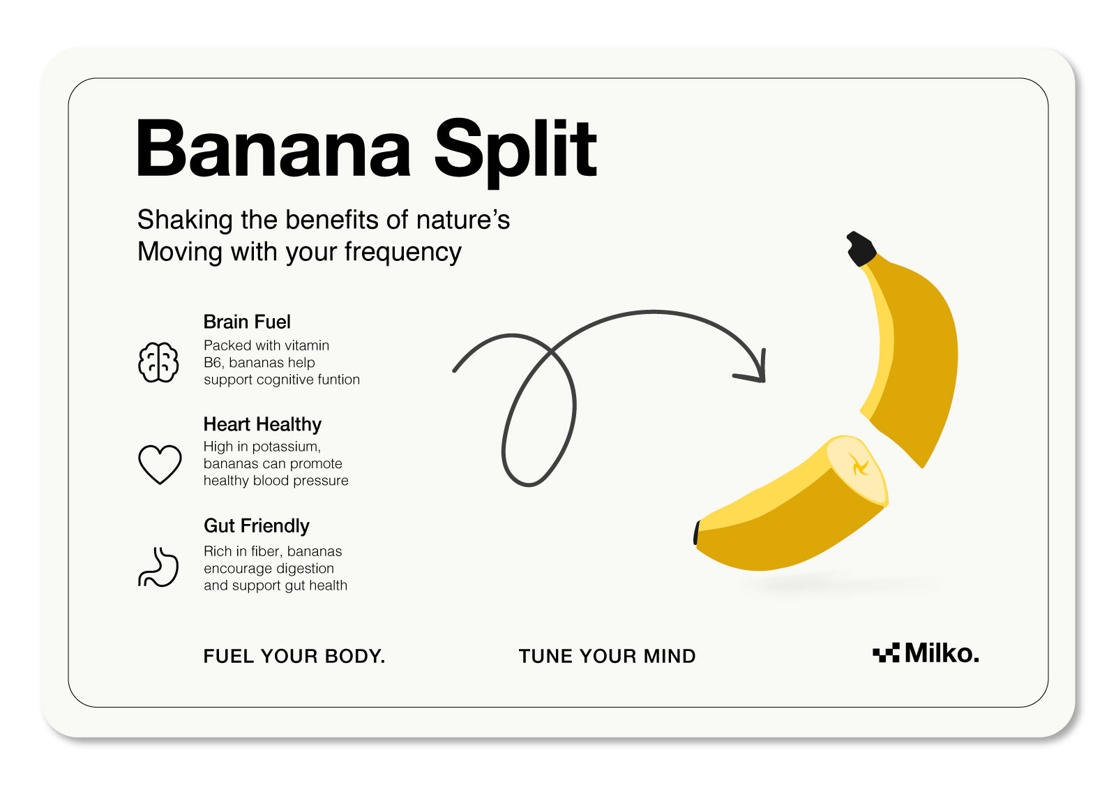
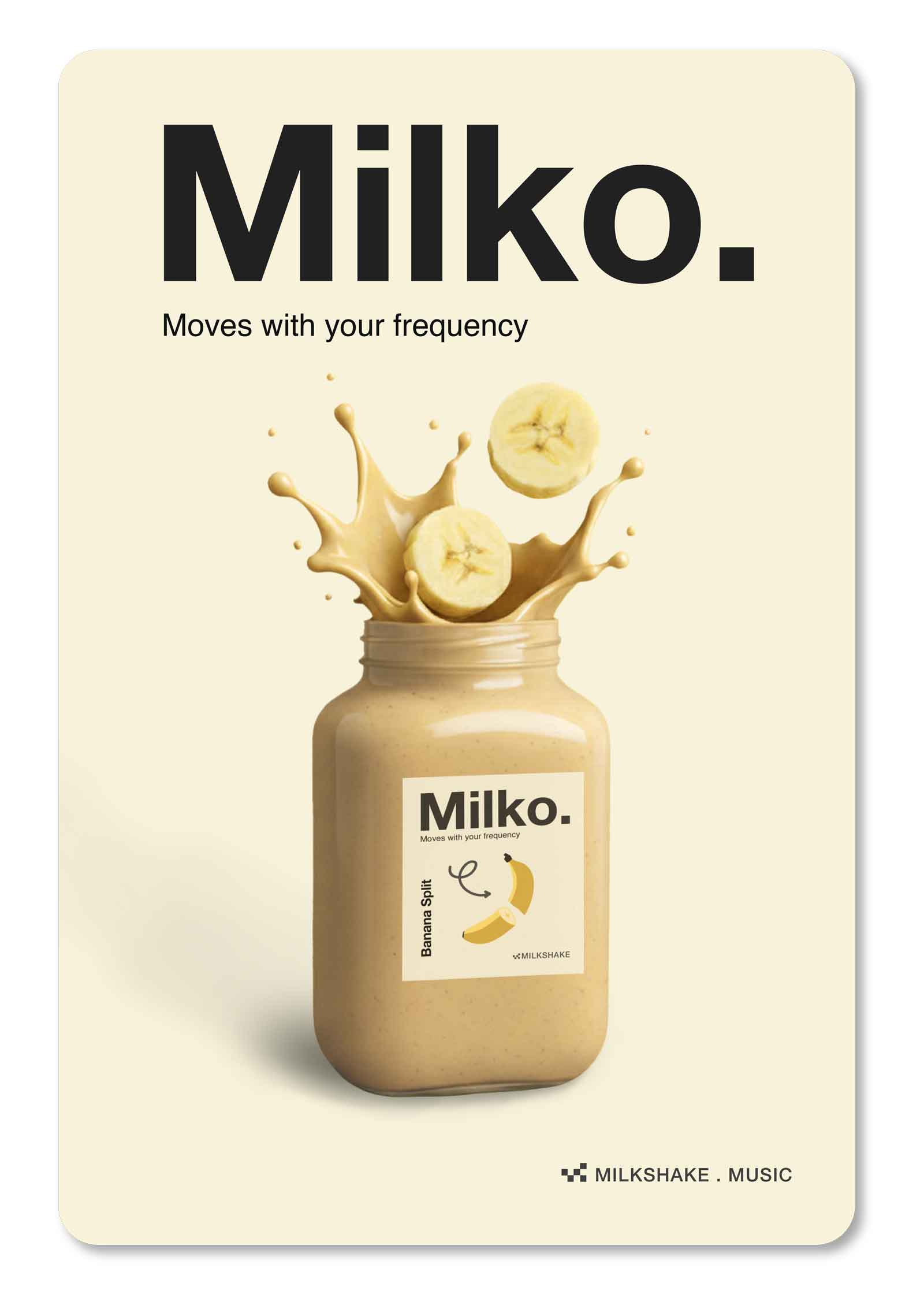
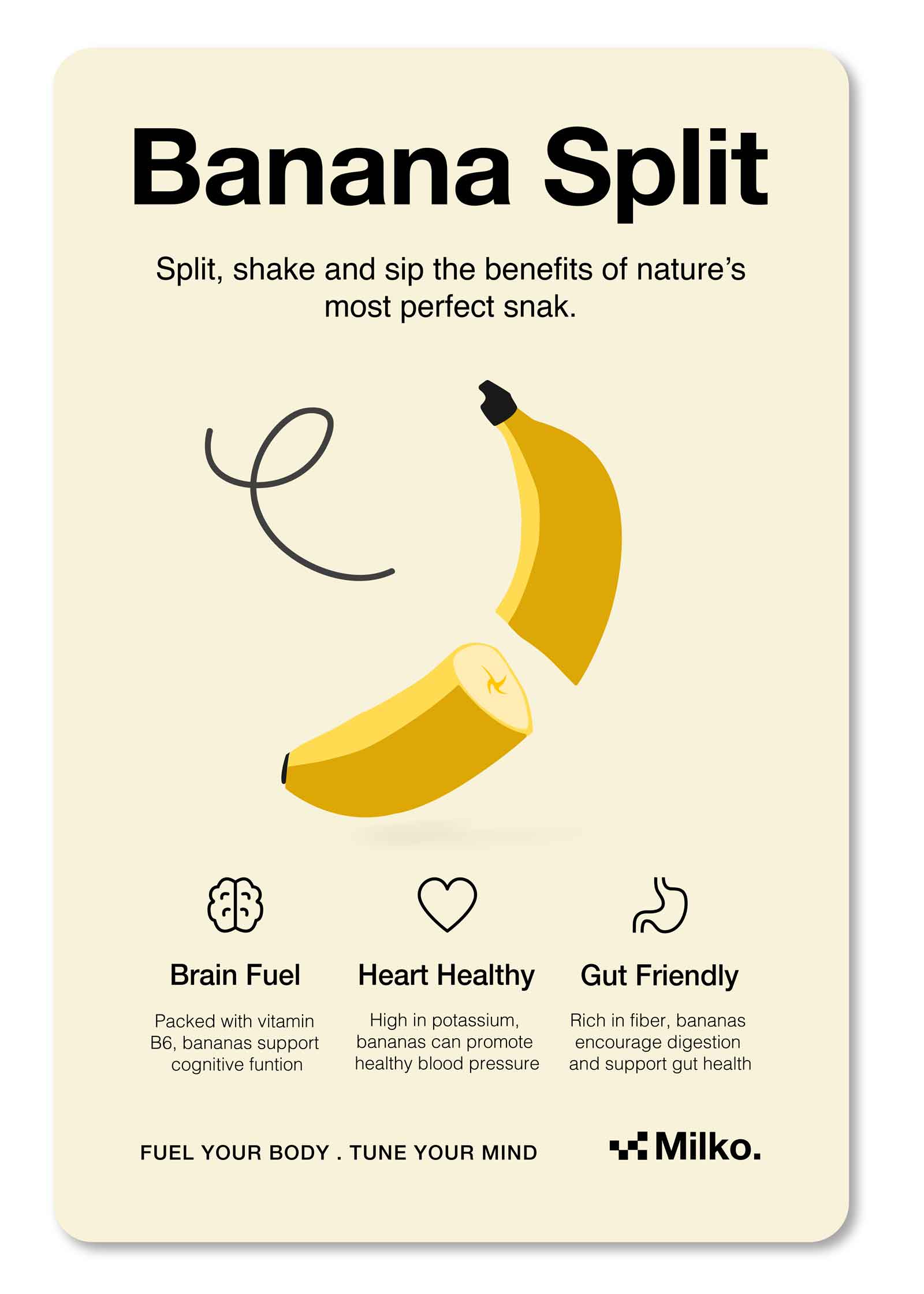
A banana, split by motion, simple and bold. The curved arrow mimics a blender’s swirl.
Form follows function, guiding the eye.
Health and movement become visual language.
A berry becomes a straw. Playful, direct, a literal twist that reads instantly.
The arrow signals motion, blending in action.
A berry with a straw? Sip happens.
This playful concept splits the word strawberry in two, literally, turning the fruit into the perfect vessel for sipping nature’s boldest berry.
With a straw sticking right out of the berry, it’s fresh and , cheeky.
Split a banana, double the fun.
A playful twist on the classic split, this concept peels back minimalism with a wink. Creamy texture, clean design, and just enough chaos to make your taste buds smile.
Set in mellow cream tones, it flows with banana’s laid-back vibe and Milko’s chill rhythm. A split-second of fun with flavor to match.
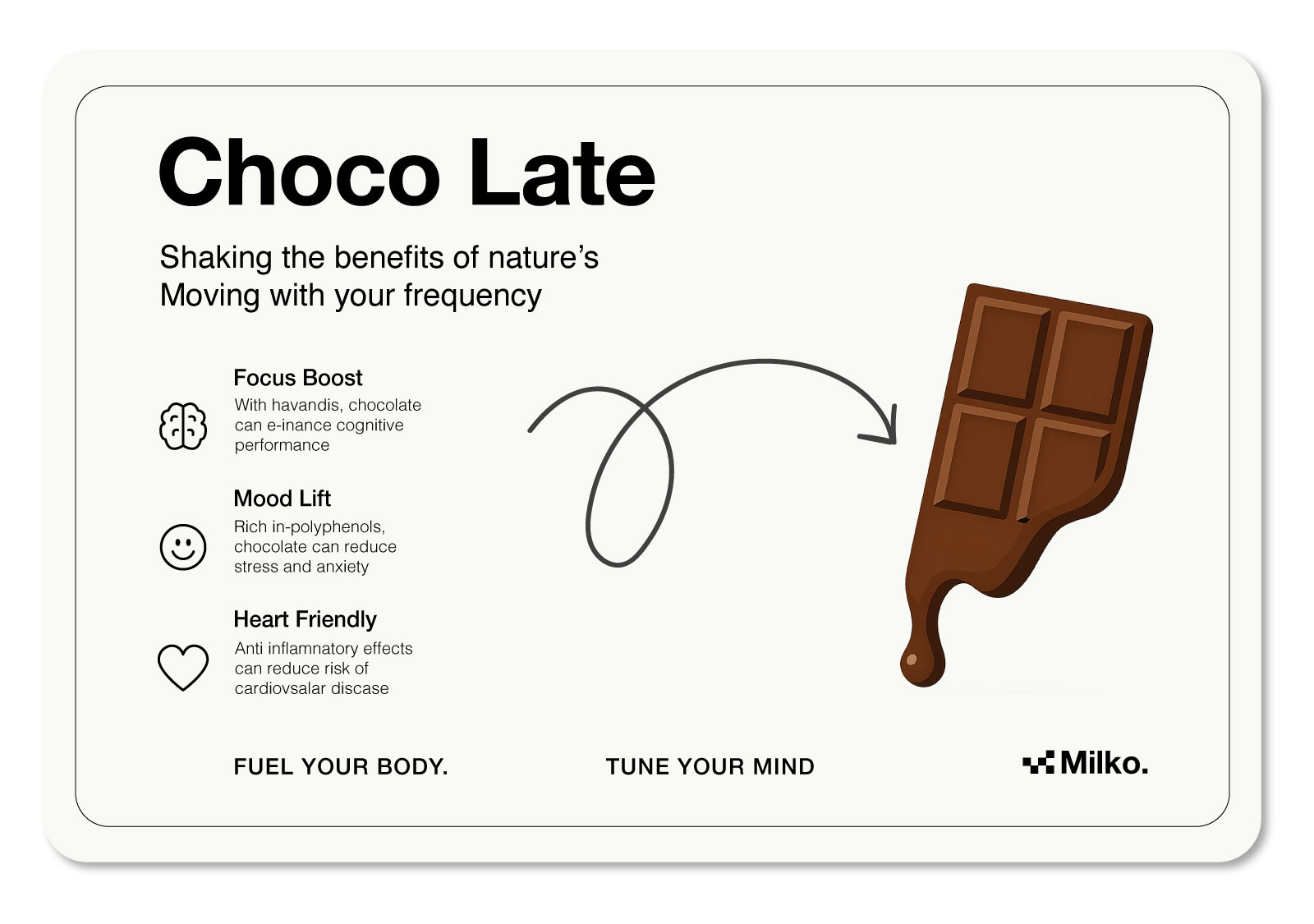
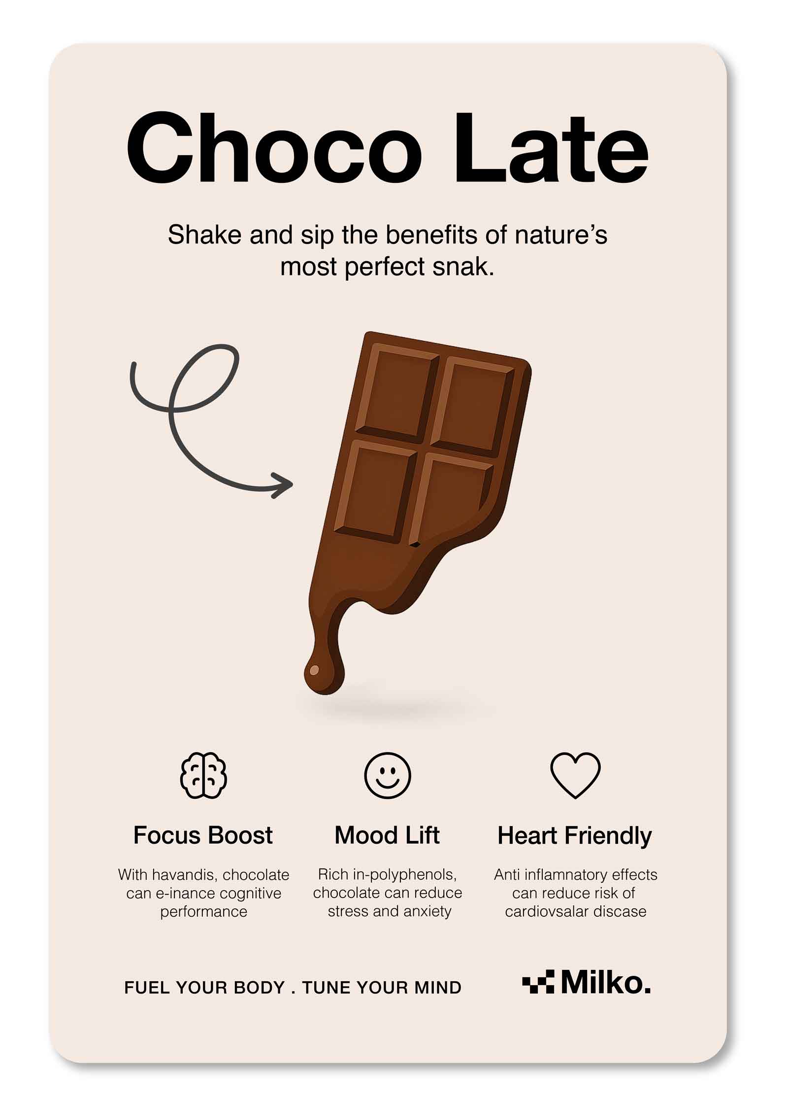
A moment worth melting for.
This concept blends indulgence with surrealism, a chocolate bar gently melting like a clock, echoing the sensation of time slipping away.
Inspired by Dalí’s iconic imagery, it humorously plays on the idea of being “late,” turning a fleeting moment into a timeless treat. Minimal, symbolic, and deliciously clever.